![]()
Brand Toolkit
Introduction
The Foundation of the Dumpsters.com Brand
Dumpsters.com is an innovative waste management company that specializes in dumpster rentals and other site services. Founded in 2014, Dumpsters.com is based in Westlake, Ohio, and has a nationwide reach, providing dumpster rental services to homeowners, contractors and businesses alike.
Here’s how to represent our brand's identity to your audiences.
Our Purpose
Our Core Purpose
We aspire to be the most customer-centric company in the waste industry so that our customers can clear the way for what's next.
Our Positioning
Customer Types Our Brand Ambassadors Target

Homeowners who value service for big projects that require debris removal.
Examples: Homeowner (Empty Nester, Amateur DIYer, Millennial Couple, Established Homeowner), Small Business/Nonprofit Owners

Premier (Small Contractors)
Local or regional companies who rent multiple dumpsters per year and value service and reliability for their waste removal projects.
Examples: Small Business Owners, Regional Project Managers, Local Contractors
Audience Positioning Statements

Retail
Homeowners with a big mess to clean up who value service, our reliable waste removal service provides a simple solution with excellent support that gives them the confidence to tackle their project(s).

Premier (Small Contractors)
For local/regional companies with regular projects who value service and reliability, our reliable waste removal service provides a dependable solution with excellent support that allows them to keep their projects on schedule.
Our Brand Promises
Delivered, Picked up and Billed as Promised
Reliable Service for a Fair Price
World-class Customer Experience
Our Brand Promise Guarantee
Delivered, picked up and billed on time, or a real person will make it right.
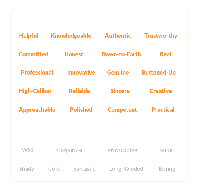
Our Voice
Our Voice
We are helpful, down-to-earth and buttoned-up. We are respectful and get down to business, but we won't try to impress you with big, fancy words.
- Helpful & practical — Offer clear solutions, anticipate questions
- Down-to-earth — Use everyday language, explain industry terms
- Buttoned-up — Polished but not corporate
- Direct — Active voice, strong calls-to-action
Brand Voice Characteristics
Brands With a Similar Voice
For inspiration, here are a few brands that effectively convey a similar brand voice across their content. These brands excel at maintaining a helpful and professional, yet approachable, voice throughout their content:
- Dove — Clean, clear, uncluttered and unpretentious. They make information accessible and relatable.
- HubSpot — Professional while still being approachable, they break down topics into digestible, actionable content without being overly technical.
- Patagonia — Authentic, straightforward and trust-building. They offer clear communication without jargon.
Our Editorial Style
Key Writing Rules
- Aim to be helpful above all else. We're here to solve problems for people
- When in doubt, consult the AP Style Guide
- Use active voice ("They'll deliver your dumpster" vs. "Your dumpster will be delivered")
- Keep to a sixth-grade reading level. Say more with less
- Write for humans first, search/AI engines second
- Contractions are encouraged
- Drop-off is hyphenated unless when used as a verb. Example: Select your drop-off location. We'll drop off your dumpster on the scheduled date.
Common Terms
✅ Do Use | ❌ Don't Use |
|---|---|
Roll off dumpster | Roll-off dumpster |
Team members/experts | Representatives/reps |
Jobsite | Job site, job-site |
Trusted partners, vetted partners, service providers, local partners, local providers | Haulers |
Content Best Practices
- No personification of dumpsters
- No clichés
- No guarantees about specific delivery timing
Brand Promises
- Delivered, picked up and billed as promised
- Reliable service for a fair price
- World-class customer experience
How to Talk About Dumpsters.com
Ambassador Talking Points
Please feel free to put these talking points in your own words. Some suggested talking points include:
Why Rent a Dumpster
- Renting a dumpster makes getting rid of all kinds of debris easy.
- You can toss flooring, old cabinets, drywall, wood scraps, countertops, household junk and other accepted materials all at once.
- We were able to get rid of all the debris from this project without wasting any time.
- Our work area can get really messy. The debris stacks up fast, so we almost always rent a dumpster before we get started.
- We always DIY our renovation projects — it only makes sense to DIY our cleanup, too!

How to Rent a Dumpster
- First time renting a dumpster? It's easier than you might think. The Dumpsters.com team is smart and friendly and is happy to walk you through every step of the process.
- They have a wide selection of dumpster sizes, so you can get rid of any mess fast.
- If you're not sure what dumpster size is the best fit, Dumpsters.com offers calculators and rental resources on their website.
- They took the time to learn about my project and set me up with the right size. I went with a 20 yard dumpster for my garage cleanout and renovation.
- You can order your dumpster online, or give them a call to order in a couple of minutes. (Be sure to use my promo code [CODE] for $X off a dumpster rental.)

How Dumpsters.com Makes Cleanup Easy
- Their driver placed the dumpster right where we needed it in the driveway to make my cleanup easy.
- They offer flexible rental periods, so we were able to clean up at our own pace.
- Their online Service Dashboard makes it easy to manage your rental entirely online. Change your delivery day, request another dumpster and schedule pickup all in one place.
- When you're done cleaning up, scheduling pickup is easy using their online Service Dashboard.

Our Visual Identity
Background
Our design guidelines ensure consistency across channels and touchpoints. These essential visual components of the Dumpsters.com brand convey our point of view and are intentionally designed to advance the brand strategy.
Our Brand Signature
Our signature logo has a unique logotype and is based in the Museo Sans 900 typeface. Do not separate, or rearrange, the logotype in any way. Never redraw or alter the logo, including the placement and size relationship of its letters, or radial arc symbol.
The Radial Arc Symbol

The radial arc symbol is a reflection of the positivity, creativity and optimism found within the core values of the Dumpsters.com brand. It most often appears in lockup with the Dumpsters.com logo, or the ‘D’ icon. The symbol can also be used alone to demonstrate brand presence, as demonstrated throughout this guide.
How the Dumpsters.com radial arc is used:
- Overlaid on imagery to showcase brand presence.
- Use best judgment in regards to placement and rotation.
- Use sparingly, and do not use more than one radial arc symbol per page, or design asset.
- Do not alter, distort or break the dashes of the radial arc in any way.
Our Brand Glyph
The Radial Arc & ‘D’ Icon
Our signature logo icon should be utilized primarily in situations in which a square, or circular aspect ratio is required, and the full horizontal signature does not fit, or is too small to be considered legible. Example scenarios include social media profile avatars and application icons.

Clearing Space
Signature Logo
Maintaining consistency in signature logo spacing and placement ensures uniformity in our brand presence and identity.
- Maintain clear space around the signature to protect the logo from distracting graphics or typography.
- For the signature, measure clear space by the height of the ‘r’ in Dumpsters.com for horizontal and bottom spacing.
- For top spacing, use the width of the ‘r’ above the radial arc.
Dumpsters.com Glyph
Maintaining consistency in icon logo spacing and placement ensures uniformity in our brand presence and identity.
- Maintain clear space around the signature to protect the logo from distracting graphics or typography.
- For the ‘D’ Icon, measure clear space by 2x the size of the glyph.
- Never allow typography, or other elements, to invade the signature or the glyph icon.
Logo Treatment & Alternate Backgrounds
Primary Use
The primary treatment and use of the signature is the full-color logo over a light background.
Secondary (Inverse) Use
The secondary treatment and use of the signature uses the inverse white logo, with orange radial arc, over D.com Blue.
Image Overlay
When overlaying the signature logo over an image, please use the Dumpsters.com inverse logo.
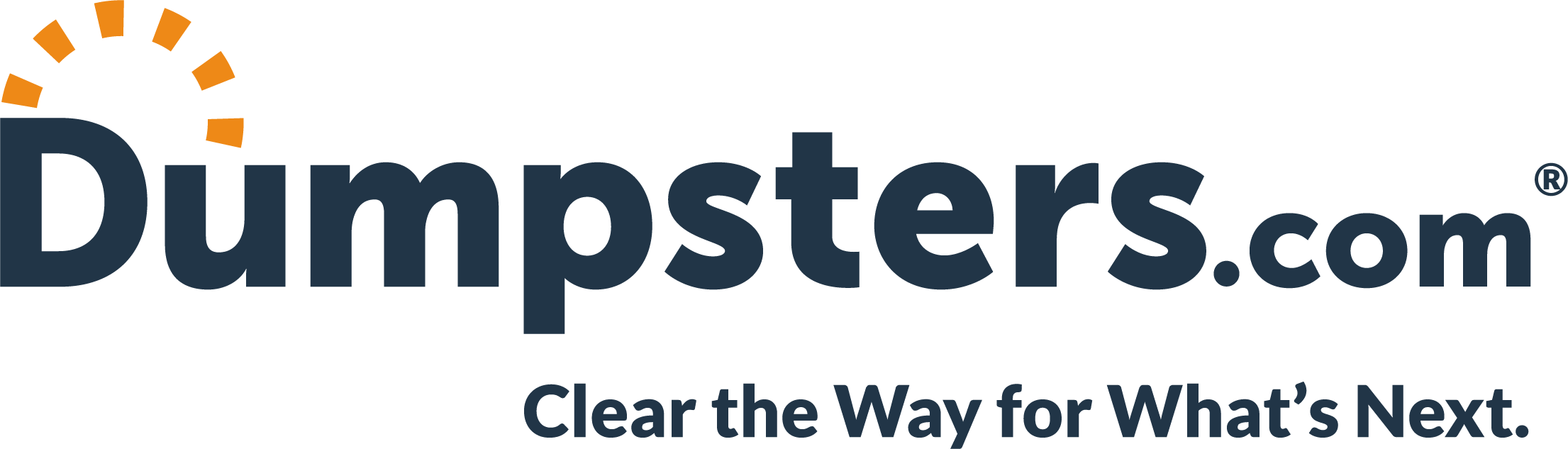
Logo with Tagline
LayoutThe tagline, “Clear the Way for What’s Next” should always be represented in Lato Heavy font, format and character properties no matter the layout, as specified here. The tagline should align to the left edge of the ‘p’ of ‘Dumpsters.com’, and align flush to the right end of the signature. As explained in the clear space instructions, so too does the ‘r’ vertical spacing hold true for the tagline.
UsageThe logo with tagline should be presented on all sales and marketing assets to communicate who we are, what we do and why we do it. Do not use the logo with tagline when the font is too small to be legible.
- Examples: display banners, email templates, social banners, video bumpers, sales presentations, waivers, billboards, letterhead templates, etc.
Logo Misuse
It is important that the appearance of the Dumpsters.com signature logo, icon and radial arc remains consistent. The logos should not be misinterpreted, modified, or added to. No attempt should be made to alter the logo in any way. Its orientation, color and composition should remain as indicated in this manual — there are no exceptions. Please reference the example violations below.
DO NOT stack the icon above the signature logo.
DO NOT apply a gradient to the icon or signature.
DO NOT rotate the logo or icon in any fashion.
DO NOT change the logo color or tone.
DO NOT distort of warp the logo in any way
DO NOT use the wordmark without the radial arc.
DO NOT outline or create a stroke around the logo.
DO NOT change the typeface or recreate the logo or icon.
Images and Templates
Downloadable Logos
Additional Logo Options
For a complete list of approved logo options, please check out the folder linked below. If you are adjusting an existing template or file with a new logo, please consult with Marketing prior to sharing externally.
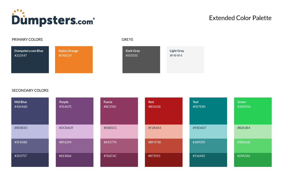
Color Palette
Our Colors
Our color palette is rooted in colors that convey our approach to innovation, strength and professionalism, accentuated by tones that embody our friendly, creative and service-oriented personality.
Our primary color, D.com Blue, reflects discipline, innovation, vision, strategy and hard work. Our accent color, Radial Orange, presents the human elements ingrained in the Dumpsters.com culture; courage, positivity, humility, hard work, determination and fun.
Primary Colors

Dumpsters.com Blue
HEX: #213547
RGB: 33, 53, 71
CMYK: 88, 71, 49, 45
PANTONE: 7546 C

Radial Orange
HEX: #FA8D29
RGB: 249, 142, 43
CMYK: 0, 54, 93, 0
PANTONE: 715 C
Secondary Colors

Teal
HEX: #007E80
RGB: 0, 126, 128
CMYK: 87, 33, 48, 8
PANTONE: 7474 C

Mid Blue
HEX: #41446d
RGB: 65, 68, 109
CMYK: 85, 78, 32, 18
PANTONE: 100-7 C

Purple
HEX: #76467c
RGB: 118, 70, 124
CMYK: 61, 84, 24, 7
PANTONE: 90-14 C

Fuscia
HEX: #8e3760
RGB: 142, 55, 96
CMYK: 41, 90, 40, 15
PANTONE: 74-14 C

Red
HEX: #b11618
RGB: 177, 22, 24
CMYK: 21, 100, 100, 13
PANTONE: 49-16 C

Green
HEX: #28d056
RGB: 40, 208, 86
CMYK: 69, 0, 91, 0
PANTONE: 148-7 C
Grays

Dark Gray
HEX: #555555
RGB: 85, 85, 85
CMYK: 64, 56, 55, 31
PANTONE: 425 C

Light Gray
HEX: #f4f4f4
RGB: 244, 244, 244
CMYK: 3, 2, 2, 0
PANTONE: 663 C
For additional options, see our extended color palette.
Typography
Lato Font Family
Aa
Lato is a sans-serif typeface family started in the summer of 2010 by Warsaw-based designer Lukasz Dziedzic (“Lato” means “summer” in Polish). In December 2010, the Lato family was published under the Open Font License by his foundry tyPoland, with support from Google. The semi-rounded details of the letters give Lato a feeling of warmth and positivity, while the strong structure provides stability and seriousness.
Hierarchy
Heading
ABCDEFGHIJKLM NOPQRSTUVWXYZ
abcdefghijklmnopqrstuvwxyz
(.,:;!@#$%^&*®©)0123456789
Styles
Regular
Italic
Bold
Bold Italic
Usage
Lato is our primary typeface used in all communication materials.
- Use type size & weight to establish a clear hierarchy of information.
- Don’t substitute any other typeface when designing for Dumpsters.com.
- For Web and printed items being published, use Lato.
Please note: due to page speed and performance requirements, all other copy will be rendered in the browser’s respective sans-serif system typeface.
Example
How We Provide a Better Experience
At Dumpsters.com, we get rid of waste so you can start new things. We rely on strong relationships, smart processes and helpful technology to give everyone a stress-free waste removal experience.
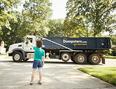
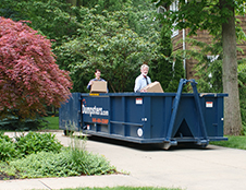
Photography
Please feel free to use the images that best represent your content. If you'd like guidance on what kinds of images we prefer to represent our brand, we've included some imagery style tips below.
Imagery Style
Select images that are:
- Natural (not posed).
- High-quality.
- Show positive emotional benefits of utilizing our dumpsters and service.
- Support the key personality traits of the brand.
- Helpful, positive, down-to-earth, buttoned-up, professional, hardworking, accessible, disarming, empathetic and patient.
- Activity-based and/or product-focused.
Please use the imagery examples showcased here for inspiration in your designs and representation of the Dumpsters.com brand across channels.


Illustration
Use of Radial Arc
The radial arc symbol can be used to demonstrate brand presence either alone or overlaid on accompanying imagery.
- Use best judgment in regards to placement and rotation.
- Use sparingly, and do not use more than one radial arc symbol per page, or design asset.
- When overlaid on accompanying imagery, use ~50% opacity on the radial arc for visibility.

For more information about this guide, or the Dumpsters.com brand, please get in touch with our team.